Outdoor advertising used to be seen by many people as a blight on the visual landscape of our cities and suburbs. But, just as authorised graffiti becomes "street art", outdoor advertising takes on a new respectability when it is "street furniture".
JCDecaux, global leaders in "street furniture" (who claim to work in partnership with more than 3500 town and city auhorities in 45 different countries), are signing contracts with more and more Australian municipal councils and transport authorities to build and maintain bus shelters, phone booths and the like in exchange for advertising placement rights on that furniture... and hence in our city streets and public landscapes. This is a somewhat different situation from the old days where a building owner sold space on his outside wall for a billboard, or a farmer allowed a "Golden Fleece Roadhouse, 5 miles" sign in the paddock by the highway.
How does JCDecaux choose sites for this "street furniture"? You might expect that public resources provided on public land under the terms of a contract with a public authority would be located where they will best serve the public. However, the evidence suggests otherwise, namely that the key advertising principle of exposure ranks significantly higher on the JCDecaux priority list than does any analysis of public utility.
As the company notes on its Australian website (under "Why JCDecaux"), "...we invest only (my emphasis) where high volume, high quality audiences are assured". Their Citylights advertising panels (the name they give to their bus and tram shelter sites) "...are a (sic) specially developed network to reach (sic) higher volumes of audience (sic) and higher income earners with disposable incomes (sic)". [Note: The appalling lack of copywriting skill on the JCDecaux website has made me "sic" all over the place!]
That's hardly surprising for an outdoor advertising company, after all. Yet some local councils seem to be trying to have their ratepayers believe that JCDecaux is providing these resources out of pure public-spiritedness. When push comes to shove, of course JCDecaux will put commercial consderations first.
South Sydney Council's arrangements with JCDecaux in the late 1990s apparently led to the unilateral relocation of bus shelters without community consultation (as noted by then NSW Parliamentarian Clover Moore, now Sydney's Lord Mayor)
The Pedestrian Council of Australia has noted that "in many cases, JC Decaux has placed... scrolling billboards directly in front of pedestrian crossings at some of the busiest intersections in the CBD", warning of their "propensity to distract drivers from watching the road and the traffic lights".
And my own experience suggests that when Councils take a laissez faire attitude to the French company's approach to the placement of advertising - sorry, street furniture - the outcomes can actually diminish public utility and cause public nuisance. Banyule City Council, which takes in the well-to-do Melbourne suburbs of Ivanhoe and Eaglemont as well as socioeconomically disadvantaged and refugee communities in West Heidelberg, announced in July 2005 that it had awarded a 15-year contract to JCDecaux "to supply, install and maintain 119 bus shelters and associated rubbish bins on main arterial and local roads throughout the municipality". The first of these of which I became aware was installed in a position where the large advertising poster on the end of the shelter completely obscured the vision of drivers attempting to make a right turn into a notorious stretch of one of these arterial roads... where it was odds-on to cause arterial bleeding!
Banyule Council received numerous calls from concerned residents even as the JCDecaux tradies were finishing the installation - nothing to do with the advertising, merely the lethality of its placement. The poster was replaced with clear glass, but this doesn't mean the same thing isn't happening at numerous other locations around the country.
And while (as per the press release) the local Councillors staged their launch photo opportunity at a new shelter in in West Heidelberg's "Mall", you can rest assured that JCDecaux will have done its sums in planning its Banyule bus shelter portfolio: a few freebies in areas like the Olympic Village are more than made up for by the fees recouped from selling ad space in other "high volume" sites with "high quality audiences".
28 June 2006
14 June 2006
Update: Nestlé acquires Uncle Tobys
The RMIT University press release re my thoughts on the acquisition of Uncle Tobys by Nestlé, as discussed on this blog on 24 May 2006, can be found here.
11 June 2006
A Tiid-ious campaign from Nissan

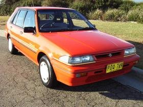
If you've watched Australian TV at all this year, you couldn't help knowing that Nissan has launched the Tiida, its small-car replacement for the Pulsar. Now, I may not be in the target demographic (said to be 30-something, female skew), but when it comes to the ad campaign, I reckon the name Tiida must be short for "tired idea". When Harry Met Sally, which featured Meg Ryan's fake orgasm scene, was made in 1989. How many times since then has the "I'll have what she's having" idea been used in advertising? Definitely for shampoo, and I think I also recall a breakfast cereal version. Anyway, as a creative idea, "product induces orgasm" is, like a 1989 Nissan Pulsar (pictured), unlikely to turn many heads or win many awards in 2006.
OK, so there are plenty of lame ads around. The reason why I really take exception to this one has much more to do with what we might call the "Trapper John, MD effect". There is something unpleasant and disheartening about the exploitation of a well-loved character from a TV show, especially when it is done in a way that is unimaginative, predictable and very unfunny.
Consumers and TV viewers can tell the difference between actors and their characters. We know it's Sarah Jessica Parker, not Sex and The City's Carrie Bradshaw, who advertises Garnier Nutrisse. But the person in the Nissan Tiida ad is clearly the character Samantha Jones, not the actor Kim Cattrall.
I want (and feel I have the right) to remember the women of Sex and The City as they were written by Darren Star and Michael Patrick King, and as we left them at the end of Season 6 in 2004*. If they are to have a life after Sex, then let Darren Star decide that - I don't want my fond memories of a landmark TV show to be sullied in any way by some Australian copywriter's idea of how "Sam" might enjoy a ride in a small Japanese car. Even if it was developed by an all-female creative team at Whybin TBWA, and they happen to be the world's biggest fans of Sex and The City, that's no excuse in my book (in fact, if they claim to be fans, that gives them even less excuse!).
*Just a reminder... in the final epsiode we left Samantha Jones in her most committed relationship yet (with Smith) and fighting breast cancer.
01 June 2006
The shape I'm in(to)

The body of a Gibson Les Paul. The headstock of a Fender Stratocaster or Telecaster. A bottle of Grant's Scotch or a Crown Lager. A Weis Mango and Cream ice cream bar. The cap of a Bic ballpoint pen.
Q: What do all these have in common? A: Each is the subject of a current shape trade mark in Australia.
And I'm glad, because apart from being a few of my favourite things, the very form of each of these classic designs deserves to be protected, and not principally because they are design icons (although they undoubtedly are). Rather, their owners deserve protection against imitators because of the effects of shape on consumers. A distinctive shape doesn't only identify a product to a consumer as being from a particular source; shape is also a highly salient (easily processed) cue to retrieval by the consumer of the network of associations in memory that actually constitutes the brand in his or her mind.
So when I see a guitar that's the shape of a Gibson Les Paul, I don't only identify it as a product from the Gibson Guitar Corporation. It calls to mind a distinctive sound, several genres of 70s rock that I associate with the guitar and its sound, songs and styles that sound better on a Les Paul, and even particular players (see Wikipedia's entry here for a far-from-comprehensive list). These recollections are also linked in my mind to quality assessments, judgments and emotional associations.
The shapes of a Coca-Cola bottle, the triangular prismatic packaging of Toblerone chocolate or a Turbuhaler asthma inhaler (also protected as shape trade marks) all tap into similar rich networks of brand associations... even if I don't know exactly who makes the products or owns the trade marks. In other words, while a shape trade mark is based on the idea of a shape being an indicator of origin, it may protect things that are a whole lot more valuable to a marketer than mere source identification.
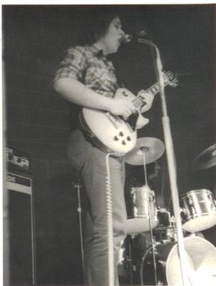
Oh, and if you're wondering about the picture... it's yours truly about 30 years ago (but who's counting?) playing an unmistakeably shaped Gibson Les Paul. (In fact, it's a Les Paul copy (!) by Ibanez, one of the companies Gibson has sued in an attempt to protect the value of that very iconic shape. What teenager could afford a real Les Paul?) Makes me wish I had been able to protect my shape (apart from the Miller shirt, perhaps)!
Subscribe to:
Comments (Atom)
