The National Heart Foundation announced a couple of weeks ago that it would be extending its "Tick program" to "everyday eating out of the home", including restaurants and food courts.
In effect, this move constitutes an extension of the Tick brand into a new category. But it comes at a time when the brand has never been more under threat, and when (I would argue) attention should be focused on brand protection rather than extension.
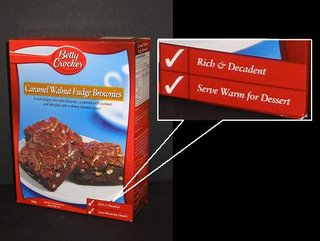
Ticks are taking over the supermarket shelves. Over recent years a tick (and very often a white tick on a red background) has come to denote first any nutritional claim ("97% fat free"), then any functional claim ("baked not fried"), and now any claim at all (just look at the picture above)! I picked up a box of Betty Crocker Brownie Mix in a supermarket last week, having noticed the white ticks on red - a familiar cue that I have come to associate with at least some level of nutritional information or endorsement. I (honestly) assumed that Betty Crocker was making some health claim - low fat, low GI, high fibre, etc. But no! Apparently, in this age of "premiumisation", when it's OK to be indulgent, even a claim of being "Rich and decadent" deserves a tick! Even Coles has commandeered the tick as the central feature of its new master housebrand "You'll love".
Don't get me wrong: there's absolutely no doubt in my mind that the Heart Foundation has built brand equity in the Tick. In fact, I'm sure that many consumers have come to rely on the Tick - just ask the copycats why they have plastered ticks all over their packaging. Even those who pay to use the official Heart Foundation Tick often stretch the friendship - Parmalat, owner of the Rev brand of low-fat milk, uses two smaller ticks right alongside the Tick to denote a claim of being a "rich source of Calcium (and) Protein".
The Heart Foundation clearly understands what the Tick is supposed to do: "Consumers rely on the Heart Foundation Tick to help them to make healthier food choices quickly and easily (my emphasis)", as they say on their website. They want us to trust the endorsement and respond to the Tick on the basis that we believe that "All Tick approved products represent a healthier choice".
Research might well show that consumers are - rationally - aware of the Tick and the "Pick The Tick" campaign, and even of the underlying objectives of the program. But we are talking here about frequent, highly routine purchases in a supermarket context. Studies of consumer behaviour in supermarkets have found average shopping times of less than 12 seconds per item, including the time taken to walk down an aisle and approach the display. Under these conditions, recognition of salient brand cues - basic colours, shapes, symbols, colour schemes and product Gestalt - is critical.
Consumers expect that these brand cues will make decision-making easier by acting as a kind of shorthand, not only for manufacturer or origin, but also for intangible associations like the trust that comes from third-party endorsement.
Faced with evidence of growing consumer confusion, the Heart Foundation has been encouraging us to make more of an effort to ensure that we are picking up the RIGHT tick. Unfortunately, once you have to tell consumers to trust SOME ticks but not others, you completely undermine their confidence and destroy the value of the Tick as a symbol: decision-making becomes more difficult and the perceived risk (of making the wrong choice) is higher.
On any critical appraisal, the Heart Foundation has failed to protect its intellectual property and it continues to suffer from very significant "leakage" of its marketing investment. Part of this stems from a poor choice of vehicle for this investment in the first place. The 1988 Trade Mark registrations for what is described as a "Correct symbol, in disc, in circle" note explicitly that "Registration gives no right to the exclusive use of the device of a TICK (CORRECT SYMBOL)". In other words, it has been known for nearly 20 years that a "tick" was too generic a choice - the Foundation can't "own" a symbol that is used so widely and non-specifically.
Secondly (and strangely, given the endorsement on the registration), it seems the Heart Foundation took a long time to recognise that it had a problem with copycat ticks. It should not have come as a surprise that other marketers would seek to exploit and leverage brand equity any way they could. But it appears that the Foundation made no regulatory attempts to stop others appropriating equity in the Tick until 1997 - that's when it lodged a Trade Mark application for a white tick on a disc of solid colour but without the words "National Heart Foundation Approved" around it. This application was rejected pretty swiftly.
The Foundation should act now - and quickly, before others like Betty Crocker completely undermine consumer brand knowledge and hence completely devalue the program - to shore up its equity in its brand elements, and plug the leaks. There are many conceivable ways to create a modified branding device that is simple, distinctive, meaningful and (above all) protectable, yet builds on what equity remains in the Tick. I'd love to hear from the Heart Foundation if they are interested...

No comments:
Post a Comment